What it takes to launch an app
Last week I launched my first iPhone app: Colordot. I’ve been launching products for almost 10 years and I expected this app to roughly take a month to build, start to finish. It took four.
This is the story about the mistakes, breaks, successes, and all the gory detail involved in launching an app. So, here’s the basic timeline, from inception to launch.
January 2nd — Inception
An early version of Colordot has been live as a web app for almost three years. Go check it out if you haven’t seen it before, it’s crucial to this story. It has entered a few people’s workflows and has around 18k active users a month.
Many users asked if there would be a mobile app. In an attempt to be entrepreneur-y about it, I stuck a quick mailchimp form in the help section asking users to sign up to be alerted when the mobile app is ready. That list hit 2.5k subscribers in late 2015. I never had a specific threshold in mind, but 2.5k felt right.
It was time to make Colordot for iOS. I had a pretty good idea of what I wanted to create. Over the years I had hacked together a few prototypes, trying out different interaction designs. I sketched out three wireframes (this took about 5 minutes), opened up Xcode and started coding.
February 8th — It’s alpha time
Hit v0.1. It’s taken two weeks longer than I expected to get to this point. Colordot now has it’s three core features: choosing colors with touch, picking colors with the camera, and support for multiple color palettes. It also doesn’t crash that often. Time to get it into the hands of other people.
It takes half a day to successfully build and upload an app for testing on iTunes Connect, Apple’s app management platform. I honestly don’t know how I would get anything done on iTunes Connect without Google & Stack Overflow 🙏. They’re like a safety net.
I send my partner an invite and check that the Test Flight build works. The app breaks almost immediately. Quick fixes, new build uploaded. I ask a few close friends to join the testing list. More obvious bugs and interaction problems surface. Work continues.
Two weeks later I’m feeling confident so I tweet out a call for testers. Through that tweet 10 more people offer their help. Colordot now has a total of 12 testers.
The more testers, the better Colordot gets. People naturally tire of trying my broken, busted-ass app. So when I change something dramatically - a new UI layout, for example - I message each tester personally and ask them to try the new build.
March 8th — The Beta
After a month of testing (I expected this to take a week), the app feels usable. With more confidence behind the concept, I begin to turn almost any conversation into an user test. Especially at industry events. You know the deal:
Me: “Hi, I’m Devin”
Them: “Hi, I’m XXXXX. What do you do?”
Me: “Well, I’m actually working on an a little app…”
I hand over my phone with a fresh install of Colordot open
Them: “… What the fuck is this.”
After a series of somewhat awkward conversations, I realize two things:
- At first, no one has any idea what they are looking at, let alone what they should do.
- After I demonstrate how the color picker works, people instantly get it. They often end up designing an entire color palette.
Colordot needs a tutorial.
March 21st — Colordot’s tutorial
My view on in-app tutorials is that it's a crutch for bad interface design. I have high standards for usability and figure that if someone can’t pick something up and figure out how to use it from the get-go, the design is a failure. And, of course, I now find myself needing a tutorial.
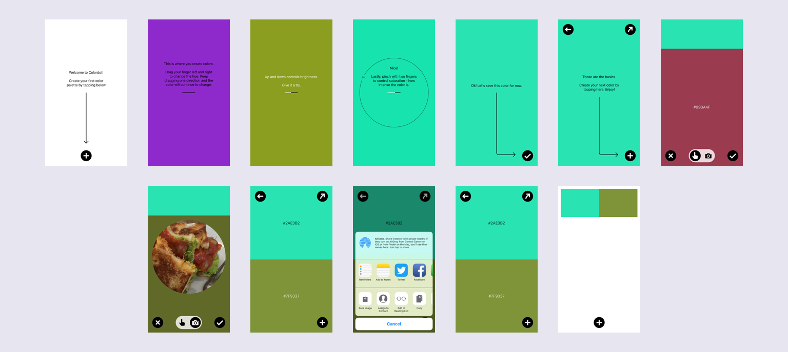
An interactive tutorial is just another app inside your app. I knew this, but I really didn’t appreciate it. The whole design process had to begin anew. I had to go back to the whiteboard and wireframe out all the steps of the tutorial, design a whole tutorial system, code it, test it, refine it, etc. The whole works. All in all, it took another two un-budgeted weeks to get right.
Since I’d been watching people use the app for the past month, I knew the key interactions which needed explanation before people got it: how to add a new color and the gestures used to edit the color. The best feature of the app - the camera picker - doesn’t even appear in the tutorial. Once people get the swipe gestures, they naturally tap the camera button. Once in the camera picker, the experience is self-explanatory. So with this in mind the tutorial went from this:

to this:

A new user is now using the full app after just a few screens and very little text.
March 22nd — Marketing materials
With Colordot nearing v1.0, it was time to shift my focus to it’s launch page and marketing materials. A majority of my time went into capturing and animating the explainer video which now sits at the top of the Colordot’s launch page. It takes about three days to get all the material together.
March 23rd — Losing the debate and winning
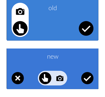
After a long, coffee fueled debate with Chris I concede that my perfect UI - specifically the button layout for the color picker - can be improved. Adding a “cancel” button to the picker UI allows users to close the picker and remove any changes made to a color. It take an hour to implement. I push the new UI to the testers.

March 24th — Surprise work
The new picker UI is received very well. But this UI improvement means I have to redo the entire demo video from scratch. Another day is spent in After Effects.
March 31st — App review
Colordot hits v1.0. I push it out to the 30 testers on the beta list and ask them to try and break the app. They do. It takes another 4 builds to get everything smoothed out. Each build-test-review iteration takes about a day.
On April 4th I submit the app to Apple for review.
April 9th — :(
Rejection! I submitted the app to Apple and after 4 days of waiting Colordot is rejected. Looks like I introduced a bug on one of my hot fixes and didn’t run all my checks. Typical. It takes just 10 minutes to fix the bug and resubmit Colordot to Apple.
April 14th - :)
Eureka! Colordot passes review. Now that publishing my first app ever on the App Store has become very real, I begin to realize I have absolutely no idea how I charge money for it and, if it sells at all, get the money from Apple. I start to read the developer & distribution agreements and discover that they’re all incorrect. None of the documents are in my company name or even at the correct address.
Thankfully, Apple Developer Support is fantastic. After a 10 minute phone call and a few verification emails the contracts are in the correct name and I can digitally sign them. Then I get to the tax paperwork.
Hailpixel - the company that I do business through - is a UK limited company. Apple, as I’m sure you are aware, is a US company. That means the IRS has a great deal of interest in what Apple does, especially with foreign companies. I need to get an EIN (Employer Identification Number) from the IRS so that Apple can prove it is sending proceeds to a foreign company and does not need to withhold tax on Hailpixel’s behalf. This is thanks to a UK-US tax treaty. After some frantic searching, I come across a series of posts with step-by-step instructions on how to call the IRS and get an EIN in an hour. After a two hour call with a very, very somber IRS agent Hailpixel has an EIN. I submit the tax forms to Apple.
My EIN doesn’t pass verification.
I call Apple Developer Support and their advice is simple: “Try it again tomorrow!”
April 15th — Tax trouble
I submit the tax forms again. They still fail. And the same the following day. I talk to the IRS, but everything seems fine. Apparently it’s just one of those delays, and might take up to three weeks.
After a bit of research, I learn that I don’t need to have the tax forms verified before launch. The tax forms are to negate the required IRS withholding and - from my understanding - as long as they are verified before you take the first payment form Apple, you should have no trouble.
April 21st — Go live
Holy shit it’s happening. I’m sure there is something I’m missing but who cares. It’s go time. I push the Colordot v1.0 to the app store. And… nothing happens. I try to buy my app and get this message: “This app is only available in the US app store”.
Wait, what. Did I miss something? I frantically look through all the settings in iTunes connect. Do I need to localize for each region? Oh shit, do I need to get translations for all regions?! DO I NEED TO REDO THE ITUNES INFORMATION??
And then all of a sudden, everything works. Turns out it takes about an hour for an app to propagate to all the app stores. Now you know.
After I confirm the app does install on a few friends’ phones, I head over to Product Hunt and post Colordot for iOS. Thus ends a 4 month journey of converting a weekend project to an iPhone app.
The final statistics
Here’s the summary of my expectations vs. reality.
Core development
Expected 2 weeks, was 2 months with including the tutorials.
Testing
Expected about a month in parallel with development and marketing. In reality, the alpha and beta tests lasted 3 months and spanned 30 testers.
Marketing
A week to put together demo video, site, and marketing hit list. Almost hit this one on the nose, took 1.5 weeks thanks to having to recreate the demo video from scratch.
Legals
Didn’t even think about this. I expected Apple’s App Store to basically take care of this. Took a full 3 days to put all the paperwork in place.
Active promotion
I expected one day; launch day. It mostly played out that way. I am glad I took the entire day off to focus on the launch. It allowed me to be responsive to all manner of questions and comments.
In Summary
Expected: A month. In reality: 4 months.
And the lessons I took away from this sole-developer experience?
- Remember the adage “estimate how much time you need for a project, then double it”? You should honestly triple it.
- Show off your work - constantly. If a person shows interest, ask them to be a tester.
- “Business” things - like contracts, tax compliancy, etc - happen at a snails pace compared to development. Start that work as soon as possible.
This project took about four times longer than expected, but I am very proud of the results. Working on something from start to finish is a rare experience in modern work. If you use colors in your work, please do checkout Colordot for iOS and let me know your thoughts on Twitter, I'm @hailpixel.
PS — Thanks
I'd like to thank a few people for all their help and support. Without it, I honestly wouldn't have finished this project. Thank you Jenny, Utku, James, Rob, Rob, Chris, Nat, Anthony, and to all the testers, suggesters, and friends. You know who you are.